Design system across platforms
- Oct 24, 2023
- 4 min read
Updated: Mar 13
A unified design system for Celsius, catering to multi-platform use and both dark and light themes, streamlined their approach, ensuring a seamless user experience across various platforms.

Summary
Celsius faced growing inconsistencies across its web and mobile products due to multiple rebrands and fragmented style guides. Components were frequently recreated from scratch, causing duplication, design drift, and inefficient collaboration with engineering.
My role was to lead the design side of rebuilding the system into a single scalable design system that could support multiple platforms, themes, and future product growth. The goal was to create a clear source of truth for both designers and front-end developers.
My role
My role was to lead the design side of rebuilding the design system, focusing on auditing and consolidating UI patterns, defining system architecture and design tokens, structuring a scalable component library, strengthening collaboration between design and engineering, and establishing documentation and governance so the system could become a reliable foundation for both designers and developers as the platform evolved.
The challenge
Over time, Celsius accumulated several disconnected style guides and UI patterns. Each team interpreted components differently, which created inconsistencies across platforms and slowed development. Designers were repeatedly recreating elements that already existed somewhere else in the product.
There was also no clear structure for how components should scale across platforms or how they should map to engineering implementation. The project required restructuring the UI layer into a system that could support both design consistency and efficient front-end development.
My role
My role was to lead the design side of rebuilding the design system, focusing on auditing and consolidating UI patterns, defining system architecture and design tokens, structuring a scalable component library, strengthening collaboration between design and engineering, and establishing documentation and governance so the system could become a reliable foundation for both designers and developers as the platform evolved.
Benefits
Single source of truth: The design system became a central repository for components, patterns, and styles, giving designers and developers a shared reference point and reducing confusion around implementation.
More focus on product problems: With reusable components in place, designers spent less time on visual adjustments and more time solving complex UX challenges and improving product experiences.
Faster and more scalable updates: System changes could be applied across products quickly, allowing teams to maintain consistency while moving faster on new features.
Consistent experience across platforms: Shared components and design rules ensured visual and functional consistency across web, mobile, and marketing surfaces, strengthening the overall user experience and brand perception.
Faster prototyping and design workflows: Pre-built components allowed designers to assemble interfaces quickly, accelerating prototyping and reducing repetitive work.
Reduced duplication and miscommunication: By standardizing components and documentation, the system eliminated many inconsistencies and reduced time lost due to unclear design–development handoffs.
System Audit
The first step was auditing existing UI patterns across products. We reviewed components, layout structures, typography, spacing rules, and interaction patterns to identify duplication and inconsistencies. This helped us identify the core building blocks used throughout the product and define which components should become system primitives.
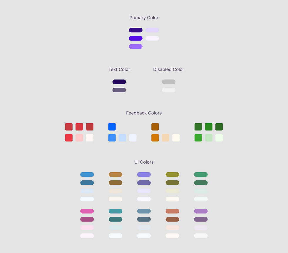
Atomic system architecture
We structured the system using an atomic approach inspired by Material Design and Tailwind-style token systems. Core primitives such as typography, color, spacing, and elevation were defined as reusable tokens. Spacing followed an 8px grid system with rem-based scaling, allowing the system to behave consistently across platforms while staying flexible for different product surfaces. This architecture allowed designers and engineers to make global updates efficiently. Changes such as color updates or spacing adjustments could propagate across the entire system.


Design and engineering alignment
To improve collaboration with developers, we embedded documentation directly into the component library. In-page annotations clarified layout behavior, spacing rules, and design intent for each component. This reduced ambiguity during implementation and helped maintain parity between design and production components.
Component library development
We identified core components used across products including buttons, inputs, navigation structures, and interactive elements. Each component was defined with states, variations, and usage rules. Components were structured with implementation in mind, ensuring they mapped cleanly to front-end components and avoided unnecessary design complexity.

Accessibility Research
Accessibility was considered throughout the design system development. We reviewed the interface against WCAG guidelines to ensure components were usable and readable across platforms. This included evaluating color contrast, especially for text and status indicators, and adjusting colors that did not meet WCAG contrast ratios, particularly in dark mode.
Accessibility rules such as clear focus states, readable typography, and adequate touch target sizes were documented within the design system so designers and developers could apply them consistently when building new features.
Reworking Status Labels and Health Indicators
During user testing, we noticed that lenders were often confused by the loan status colors, which sometimes led to incorrect assumptions about the health of their loans. To address this, we reviewed and reorganized all of Celsius’s status labels, separating system statuses from health indicators and introducing clearer visual distinctions between them to improve clarity and reduce misinterpretation.

Design language and branding
Working closely with the marketing team, we unified branding across product and marketing surfaces. This included standardized color palettes, typography systems, logo variants, and iconography.
A custom icon library and illustration set were introduced to support the product interface while maintaining brand consistency.
Integration with Storybook
The design system was connected to the development component library through Storybook. This ensured both designers and developers had access to the same component definitions and guidelines while building features. This integration helped reduce discrepancies between design and front-end implementation and improved development speed.
Continuous iteration and governance
The system was designed to evolve alongside the product. We established a feedback loop where designers and developers could identify gaps, propose improvements, and iterate on components as the platform grew. Regular updates ensured the system remained relevant as product requirements changed.
Outcome
The unified design system eliminated duplicated design work and created a shared foundation for product development. Designers could build new interfaces faster using reusable components, while engineers benefited from clearer component definitions and more predictable implementation. The system improved collaboration between design and development teams, increased consistency across platforms, and created a scalable foundation for future product growth.


Comments