
Creative direction and consulting projects
A selection of consulting and design projects where I led creative direction, art direction, visual systems, product design, and digital experiences across B2B, B2C, P2P, web, and mobile products.
Start with why
I like bringing clarity to creative and product work. In many of these projects, the direction was still open, the product needed stronger structure, or the brand needed a clearer visual voice. My role was to help teams shape the idea, define the direction, and turn it into work that felt intentional, useful, and easy to understand.
How I lead creative work
I usually start by understanding the audience, the business goal, and the feeling the product or brand needs to create. From there, I define the creative direction, align the team around a clear visual language, and make sure the final work stays consistent across product, brand, campaign, and content touchpoints.
Creative leadership focus
Across these projects, my work moved between strategy, creative direction, hands-on design, and team alignment. I worked with clients, founders, product teams, and stakeholders to turn abstract ideas into clear deliverables, guide visual decisions, and create systems that were easier to scale and maintain.
Core strengths
Creative direction
Art direction
Visual systems
Brand expression
Product storytelling
UX strategy
Campaign assets
Interface design
Client consulting
Stakeholder alignment
Design leadership
Carlsberg Posters
I designed a set of abstract posters featuring J.C. Jacobson, the founder of Carlsberg, for a local digital art gallery exhibition. The work was created in collaboration with the Israeli Carlsberg group and focused on building a visual language that felt bold, historical, and modern at the same time. This project gave me space to lead the art direction, explore composition and symbolism, and connect brand heritage with gallery-style visual expression.


Posters challenge
I created a series of daily posters as part of a 30-day design challenge in 2020. Each poster was designed under strict time limits, which helped me sharpen my visual decision-making, layout instincts, typography choices, and creative flexibility. The challenge pushed me to move fast, explore different styles, and keep a strong level of visual quality under pressure.
Matterwear social ads and brand assets
Developed the social media strategy, content plan, and visual identity for Matterwear, a t-shirt brand, ensuring seamless alignment with its style guides, tone of voice, and overall presence. Designed t-shirt graphics and social media posts that captured the brand's ethos, creating engaging campaigns that resonated with the target audience while amplifying the brand's reach and consistency across all platforms.
T-shirt designs:
I designed t-shirt graphics that translated the brand identity into wearable visual pieces with a clear style and audience fit.
Social media banners:
I designed social media assets that helped the brand communicate its style, values, and campaigns across digital channels.
Banksia
Banksia is a prime brokerage crypto platform built for global institutional clients. The goal was to give institutional investors more control over a process that had previously been manual and operationally heavy. My work focused on shaping a clear product direction for complex financial information, with dashboards and asset screens that felt structured, trustworthy, and easy to scan.


Voxel editor
This mobile app explored user-generated game creation in a simple and playful way. The goal was to help users create voxel models as part of a larger mobile game creation experience. My focus was to shape the creative and interaction direction so the editor felt accessible, light, and visually inviting, even for users without 3D modeling experience.

Gaming client
These screens were part of the Intel Gaming Access app experience. The onboarding flow introduced users to the product, explained the value, and helped create the first impression of the experience. My focus was on product storytelling, visual hierarchy, and creating a clean entry point into a gaming-focused digital product.


Plan checkout
These screens were part of a product payment flow. The goal was to keep checkout focused, clear, and low-friction by showing only what users needed to confirm the purchase. My focus was on visual clarity, hierarchy, and trust, making the payment moment feel simple, safe, and easy to complete.

Social profile modal
These modals were designed for outsourced social profile pages within a blog platform. The experience allowed users to follow and be followed through familiar social patterns. My focus was on creating a compact, clear, and reusable UI direction that made the interaction feel simple inside a limited modal space.


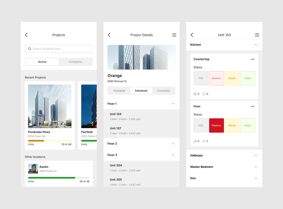
Apartment handover module
This app supported the apartment handover process between a construction company representative and an apartment owner. The module helped manage, track, and document handover steps that were previously handled in a more manual way. My focus was on structuring the mobile experience so the process felt organized, practical, and easy to use in the field.

Collaborative mapping platform
This mobile app supported a collaborative mapping platform that helped people find and share information about places and objects they care about. The goal was to make discovery and contribution feel simple on mobile. My focus was on shaping a community-driven experience with clear navigation, simple contribution patterns, and a visual structure that supported exploration.


Comments